Material Design and Flutter both help developers build experiences that are flexible, accessible, and expressive, while delivering great performance and efficiency. Now we’re pleased to give you even more ways to create distinctive UIs with improved support for Material Icons in Flutter.
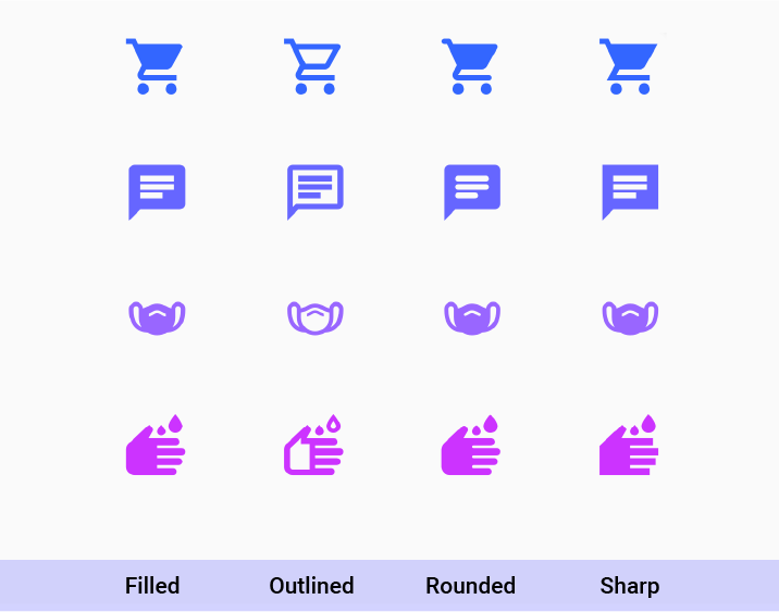
Material Icons are beautifully crafted symbols for common actions and items, including everything from simple arrows and indicators for navigation, to symbols representing concepts like accessibility, bug reporting, and even hand washing.
Flutter now has support for all four icon styles — filled, outlined, sharp, and round — to help you make your app or web site familiar and accessible for your users, while allowing you to uniquely communicate your brand. And with support for tree-shaking, Flutter optimizes your app build to include only the symbols you’re using, making load times and memory use more efficient.
Here are a few icons that showcase the range of options you’ll find in Material’s catalog. You can browse the full set of icons and download bitmap or vector versions for use in your favorite design tool on Material.io, or view Flutter’s versions on the Icons API page.
Getting started
To get started with the Icon class, make sure to set uses-material-design: true in your project’s pubspec.yaml file. This tells Flutter to include the icon assets in your application.
Icons in Flutter are delivered as vectors via an icon font, so you can infinitely adjust size and color without worrying about losing image quality. Checkout GitHub for the code that generated the set of icons above.
Don’t skip the semantic label!
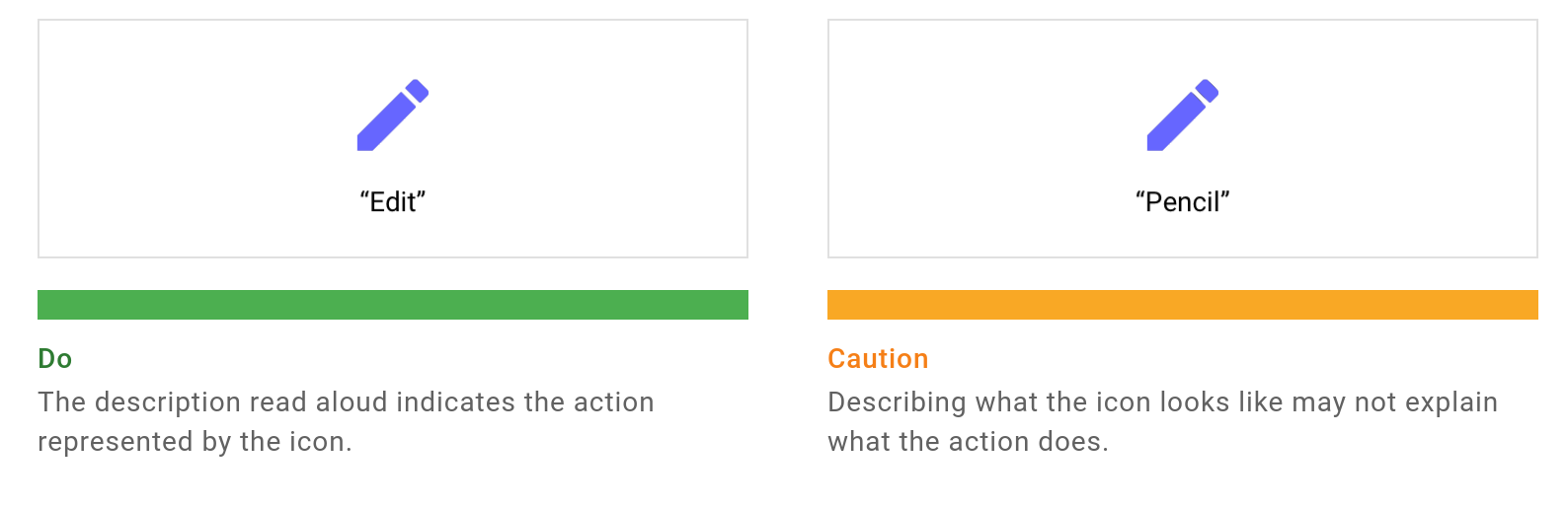
In order for users of assistive technologies like screen readers to effectively navigate your app or site, it’s important to provide a semantic label that is meaningful and contextually appropriate.
By default screen readers read aloud any text that’s visible onscreen. To accurately translate visual elements like icons into text-based UI, you need to thoughtfully label those elements.
For example, when an icon is used in conjunction with an action element, like a button, you should always set your semantic label to a string that describes what happens when a user clicks on it.
Material.io offers guidance on indicating UI elements by action. A common mistake is to default the semantic label to the name of the icon, as opposed to the action that is performed when that icon is selected.
To learn more about the importance of building accessible digital experiences, see Accessibility on flutter.dev.
Only ship what you use!
When you build your app for release, the Flutter compiler performs “tree shaking”, removing unused code and assets (including icons) to optimize your app’s footprint and help minimize download and load times. Use all the icons you want! During compilation, a custom icon font is generated, containing only the subset of icons used in your project. This offers great reduction in binary size — everybody wins!
In addition to tree-shaking, here is a great community post about best practices for reducing Flutter app size.
Show us what you’ve got!
Developers all around the world are using Material icons to ensure readability and clarity at both large and small sizes; these icons have been optimized for beautiful display on all of Flutter’s supported platforms and display resolutions.
Follow: Medium.com
You need to login in order to like this post: click here
YOU MIGHT ALSO LIKE

SUBSCRIBE TO OUR NEWSLETTER