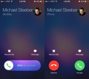
Have Apple iPhone users ever noticed that when a call comes in, the screen displays different ways to answer it? Sometimes, your iPhone vibrates in your pocket, you get an incoming call, and when you take it out, the screen prompts you to swipe to answer. But the next day, while scrolling through your feed, you get the exact same call, but this time it shows both an “answer button” and a “hang up button” to choose from.
Many might think Apple’s system is glitching or randomly displaying the answer. Why not design it to be the same every time? But believe it or not, the design team has thought of everything behind this seemingly contradictory difference.
Although Apple doesn’t state the reason in the manual (because they consider it a trade secret and design secret), the Support page clearly explains the different ways to answer a call by tapping the screen.
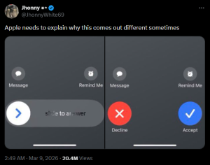
It became a topic of discussion through the account X, @JhonnyWhite69, which garnered 10 million views and over 100,000 likes in less than a day. He posted the question, “Apple needs to explain why this sometimes appears differently,” demonstrating considerable interest in the iPhone call answering screen.
Furthermore, similar questions were raised on User Experience Stack Exchange, a Q&A website for user experience (UX) designers, with posts showing the differing screen layouts for accepting and rejecting incoming calls, along with the same underlying concern.
Why do the two incoming call UI variations seem contradictory?
When the screen is locked, you slide from left to right to answer a call. But when the screen is unlocked, you tap the button on the right side instead.
This means you’re essentially tapping or initiating an action from different sides depending on the screen’s lock state. It might not seem like a big problem, but isn’t this an inconsistent interaction pattern?
Tim Fitzgerald, a user experience consultant for a corporate IT department with experience as an IT service manager and web developer, explained the key reasons behind the aforementioned post as follows:
From a UX designer’s perspective, there are three reasons behind the different appearance of the iPhone’s call answer screen that we see:
1. Gesture Habits
The “Slide to Answer” gesture isn’t randomly generated; it’s designed to mirror the “Slide to Unlock” command and other shortcuts like swiping right on a message notification to open it. These gestures represent the same language Apple has consistently used to communicate to users: “To start using the device, slide your finger.”
2. Pocket Security Mechanism
Sliding to answer a call acts as a “security system.” If Apple designed it as just a “button” while the device is locked, a major problem would arise, as the screen could come into contact with fabric or the heat inside the pocket… “Accidental Call Answering”: Forcing the “slide” button to answer is the surest way to prevent the device from haphazardly activating itself while in your pants pocket.
3. Different Starting Points, Same Ending Point
Although “slide” and “button” screens have different starting points for your finger (one requires dragging, the other just touching), both are designed with a similar “end point” for answering calls. This allows for muscle memory, ensuring your fingers become accustomed to the same function regardless of the device’s state.
This seemingly logical explanation, while not directly from Apple, reflects their emphasis on security and preventing errors over aesthetically identical responses when the device is locked—a small detail users may not have noticed before.
You need to login in order to like this post: click here
YOU MIGHT ALSO LIKE

SUBSCRIBE TO OUR NEWSLETTER